İznik vs. Kütahya Ceramics: What’s the Difference?
- Aug 8, 2025
- 4 min read
Step into any well-stocked ceramic store in Istanbul and you'll likely be greeted by two names: İznik and Kütahya. Both are stamped into the DNA of Turkish ceramic artistry, yet they're often confused, interchanged, or lumped together under the banner of "Ottoman style." But look closer—really look!—and you'll start to see that these two traditions, while kin, speak with distinct accents. Their colors, forms, histories, and purposes all diverge in ways that tell a much larger story about Turkish identity, trade, and the shifting role of craft in everyday life.
At Q-arts, we draw on both legacies, but we also believe understanding them is part of the pleasure. So let's take a deeper look.
İznik: Imperial Precision, Capturing the Height of Ottoman Design
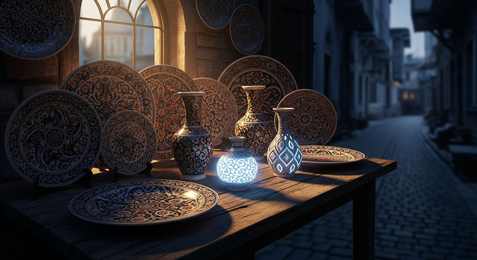
İznik ceramics emerged in the 15th century in the town of İznik (ancient Nicaea), and quickly became the artistic darling of the Ottoman court. These pieces were never meant to be subtle. They were made to dazzle: Walls of mosques, palace kitchens, the tiles above your head in a Sultan’s hammam. That level of prestige left no room for error.
The hallmarks? Cobalt blue was the foundation, influenced heavily by Chinese porcelain. Then came turquoise, sage green, and eventually Armenian bole red, a rich, iron-heavy pigment that gave floral motifs their grounding and contrast. These weren't mere decorations; they were imperial propaganda, stylized tulips and saz leaves arranged in symmetrical explosions of pattern.
But İznik ceramics weren't just about beauty. They were technical marvels: Underglaze-painted, double-fired, and carefully balanced in composition. You'll notice the sharpness of lines, the weightlessness of forms. The symmetry isn't accidental; it’s a visual language of balance, unity, and control.
İznik production declined sharply in the 17th century. There are many theories why: the empire's financial troubles, shifts in aesthetic taste, changes in patronage. But the legacy stuck. Even today, mention "Ottoman ceramics," and most people picture İznik.
Kütahya: Domestic Warmth, Religious Symbolism, and Storytelling
Now compare this with Kütahya, a central Anatolian town that picked up the ceramic mantle when İznik fell silent. The style is older, technically speaking—there are Roman-era kilns in the region—but its Ottoman heyday began in the late 1600s and bloomed into the 18th and 19th centuries.
Where İznik felt imperial and ceremonial, Kütahya felt personal. These were ceramics for the home, the chapel, the market. Plates bore folk scenes, Armenian inscriptions, religious motifs, even portraits, a huge departure from İznik's abstract formalism. Kütahya's Armenian master potters were known for a freer hand and a vibrant, almost naive aesthetic that invited warmth rather than awe.
Color was another big shift. Kütahya ceramics embraced a broader palette: yellows, pinks, orange ochres; tones rarely, if ever, seen in İznik work. The glazes often had a slightly milkier, matte finish. Shapes were more varied, and the symmetry of İznik gave way to narrative spontaneity. Where İznik painted with ideology, Kütahya painted with intimacy.
And yet, Kütahya didn't lack sophistication. Its tiles graced Armenian churches as far away as Jerusalem, and many pieces show a remarkable fluency in composition and storytelling. It simply chose to serve different ends.
İznik was a language of power. Kütahya was a dialect of the people.
That's the simplest way to frame the difference. İznik spoke in the measured cadence of courtly refinement. Kütahya laughed, gestured, and improvised. One served the sultan; the other served the hearth.
You'll often see modern ceramics described as "İznik-style" even when the patterns are loose or the glazes differ. That's branding, but it’s not always accurate. A careful eye knows that the crisp precision of İznik can't be faked. Nor should Kütahya's storytelling warmth be overshadowed by it. Each has its place, and both are essential to understanding Turkish ceramic heritage.
So how do you tell them apart today?
The easiest clue is usually the decorative style.
İznik pieces will almost always feature floral arabesques, saz leaves, tulips, and carnations, usually in well-structured, symmetrical layouts.
Kütahya ceramics, meanwhile, feel looser, more illustrative. You may spot birds, people, or even religious scenes—subjects absent in İznik work.
Color palette is another giveaway.
İznik stays close to blue, green, turquoise, and later bole red.
Kütahya experiments with warm tones, pale pastels, and even black outlines.
The finish can also tell you something. İznik is often glossy and dense, while Kütahya may appear softer, especially in earlier pieces. However, many contemporary artisans blend both styles or reinterpret them freely, so the lines aren't always rigid.
At Q-arts, we honor both legacies, but we’re not limited by either.
Many of our collections are rooted in the elegance of İznik. Others are infused with the storytelling spontaneity of Kütahya. Some pieces deliberately blur the two: An İznik form painted in Kütahya colors, or a folk-inspired motif executed with İznik-level precision.
We're not in the business of copying museum pieces. What we do instead is take the enduring spirit of these traditions and let them speak in today's language. That's what keeps Turkish ceramics alive: Not just replication, but reimagination.
Visitors often ask us which style is "better." That’s like asking whether poetry or prose is better. İznik and Kütahya aren't competitors. They're co-conspirators in the ongoing story of Turkish ceramic art.
Which speaks to you?
Some are drawn to the calm order of İznik: The symmetry, the formality, the historical weight. Others love the immediacy of Kütahya, where narrative breathes and colors hum with domestic joy. And some choose not to choose, letting their home reflect a blend of both.
Whatever you’re drawn to, we’re here to guide you whether you're a curious traveler or a seasoned collector. When you hold one of our pieces in your hands, you’re not just buying a decorative object. You’re stepping into a centuries-long conversation, one that still has so much to say.